When it comes to selecting the right thread color for your custom-made chenille, embroidered or woven patches, there are several factors to consider, since the color you choose can significantly impact the overall design and visual appeal of the patch. Make sure that you are using the Pantone Matching System (PMS) if you are matching thread colors from an existing object, patch or from an earlier project. Here are some key considerations to keep in mind when selecting thread colors.
1. Contrast and Visibility
One of the primary considerations when choosing thread colors is contrast and visibility. The thread color should contrast with the background fabric to ensure that the design is clearly visible. For example, if you’re working with a dark fabric, using light-colored threads will create a high contrast and make the design stand out. On the other hand, if you’re working with a light fabric, using dark-colored threads will achieve the same effect. It’s important to test different thread colors on the fabric before finalizing your choice to ensure optimal visibility and legibility of the design.
2. Brand Identity and Aesthetic
If you’re creating patches for your brand or business, it’s important to consider your brand identity and aesthetics when selecting thread colors. The colors you choose should match with your brand’s color palette and convey the desired message or emotion. For example, if your brand is known for its vibrant and energetic personality, using bold and bright thread colors can reinforce that image. On the other hand, if your brand is more understated and sophisticated, opting for muted and subtle thread colors may be more appropriate. By staying true to your brand’s identity and aesthetic, you can create custom patches that are consistent with your overall brand image.
3. Design and Style
The design and style of your custom patches will also influence the choice of thread colors. Consider the elements and details in your design, and choose thread colors that complement and enhance those aspects. For example, if your design features intricate floral patterns, selecting thread colors that mimic the natural colors of flowers can create a harmonious and visually appealing patch. On the other hand, if your design is more abstract or geometric, using contrasting thread colors can create a bold and eye-catching effect. By carefully considering the design and style of your patches, you can select thread colors that bring out the best in your design.
4. Context and Intended Use
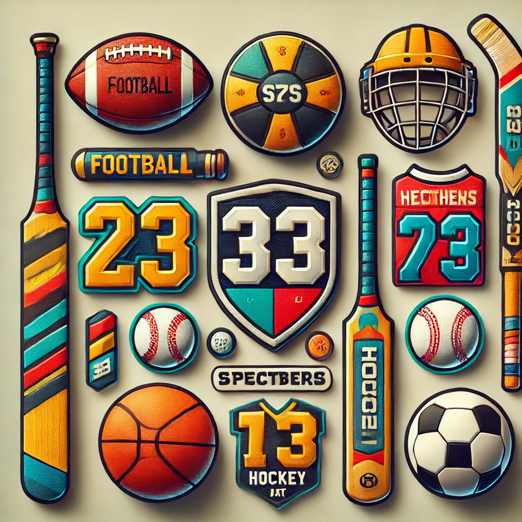
The context and intended use of your custom patches should also be taken into account when selecting thread colors. Consider where and how the patches will be used and the impact you want them to make. For example, if you’re creating patches for a sports team, using the team’s colors can help foster a sense of unity and identity. If you’re creating patches for a specific event or occasion, incorporating the event’s theme colors can create a cohesive and memorable experience. By considering the context and intended use of your patches, you can select thread colors that resonate with your audience and make a lasting impression.
By carefully considering these factors, you can choose the right thread colors for your patches. Remember, the thread colors you select can significantly impact the overall design and visual appeal of the patches, so take the time to explore different options and test them on the fabric to ensure the best results.
Popular Thread Colors for Different Patch Designs
When it comes to thread colors for custom patches, there are endless possibilities. The colors you choose can significantly impact the overall design and visual appeal of the patches. Here are some popular thread colors for different patch designs to inspire your creativity.
1. Classic and Timeless
For a classic and timeless look, you can’t go wrong with black and white thread colors. Black thread creates a bold and striking effect, while white thread adds a touch of elegance and sophistication. These colors are versatile and can be used for various patch designs, from logos to lettering to intricate patterns. They create a high contrast against most fabric colors, ensuring optimal visibility and legibility of the design.
2. Bold and Vibrant
If you want your patches to make a bold statement, consider using vibrant and eye-catching thread colors. Colors like red, orange, and yellow evoke a sense of energy and excitement. They are perfect for patches that need to grab attention and create a strong visual impact. These colors work well for sports teams, promotional patches, and designs that require a dynamic and lively look.
3. Subtle and Elegant
For a more subtle and elegant look, consider using pastel thread colors. Colors like light blue, soft pink, and mint green create a delicate and sophisticated effect. They are perfect for patches that require a gentle touch and a refined aesthetic. These colors work well for fashion brands, wedding patches, and designs that prioritize a soft and feminine look.
4. Natural and Earthy
If you’re looking to create a design inspired by nature, consider using earthy thread colors. Colors like brown, green, and beige can mimic the natural colors of trees, leaves, and soil. They create a harmonious and organic effect, making them perfect for patches that celebrate the beauty of the outdoors. These colors work well for camping patches, environmental organizations, and designs that aim to evoke a sense of tranquility and connection with nature.
5. Patriotic and National
For patches that showcase national pride or patriotism, consider using the colors of the flag or national emblem. Whether it’s red, white, and blue for the United States or red and white for Canada, incorporating these colors can create a strong and recognizable design. These colors work well for military patches, national sports teams, and designs that celebrate a country’s heritage and identity.
These are just a few examples of popular thread colors for different patch designs. The possibilities are endless, and it’s important to choose thread colors that align with your design and desired visual impact. Remember, thread colors can significantly enhance the overall design and appeal of your patches, so take the time to explore different options and experiment with combinations to find the perfect match.
Tips for Selecting Thread Colors for Customizing Patches
Selecting thread colors for your patches can be an exciting and creative process. Here are some tips to help you make informed decisions and create visually stunning patches.
1. Consider the Fabric Color
Before selecting thread colors, consider the color of the fabric on which the patches will be applied. The thread colors should contrast with the fabric to ensure optimal visibility and legibility of the design. For example, if you’re working with a dark fabric, using light-colored threads will create a high contrast and make the patches stand out. On the other hand, if you’re working with a light fabric, using dark-colored threads will achieve the same effect. It’s important to test different thread colors on the fabric before finalizing your choice to ensure the best results.
2. Use Color Theory
Color theory can be a valuable tool when selecting thread colors. Understanding the psychology of colors and their impact can help you create patches that evoke specific emotions or convey a particular message. For example, warm colors like red and orange can create a sense of energy and excitement, while cool colors like blue and green can evoke a feeling of calm and tranquility. By considering the desired emotional response or message, you can choose thread colors that reflect your intentions and resonate with your audience.
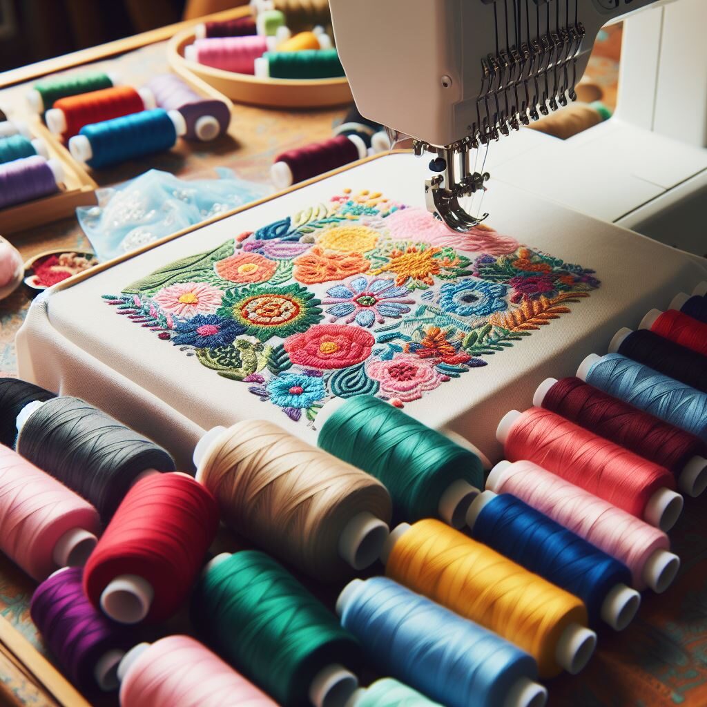
3. Test Different Combinations
Don’t be afraid to experiment with different thread color combinations. Sometimes, unexpected combinations can create the most visually stunning effects. Test different colors together and see how they interact and complement each other. Consider using contrasting colors to create a bold and eye-catching effect or complementary colors for a harmonious and balanced design. By testing different combinations, you can find the perfect match that brings your design to life.
4. Consider the Design Elements
Consider the elements and details in your design when selecting thread colors. Choose colors that complement and enhance those aspects. For example, if your design features intricate floral patterns, selecting thread colors that mimic the natural colors of flowers can create a harmonious and visually appealing patch. On the other hand, if your design is more abstract or geometric, using contrasting thread colors can create a bold and eye-catching effect. By considering the design elements, you can choose thread colors that bring out the best in your design.
5. Test in Different Lighting Conditions
Remember that the appearance of thread colors can vary depending on the lighting conditions. It’s important to test your chosen thread colors in different lighting environments to ensure that they achieve the desired effect. Natural lighting, indoor lighting, and outdoor lighting can all have an impact on how the colors appear. By testing in different lighting conditions, you can make sure that your custom patches look their best in any situation.
By following these tips, you can select thread colors that enhance the design and visual impact of your patches. Remember, thread colors play a significant role in the overall appearance of the patches, so take the time to explore different options and experiment with combinations to find the perfect match.